I find it easiest to move my image to the left when I am writing my text.
For this particular invitation, I did every line separately so that I could move it around the invitation as I placed it. It's tedious, but in the end it's easier to manipulate.
I used Courier font for the text.
The final invitation had more words and text than I am showing you here, but the whole idea for the end product is the same. Hit shift and mouse click to select the font that you want to work with. I wanted all of the font so that I could change it from a cut image to a printed image and also so that I could change the color.
Silhouette wants to automatically cut your image.
If you are printing, you need to make it a no cut image.
Once you change your image to no cut, Silhouette automatically lightens your image in that screen.
Escape from that screen and it will go away.
If you are ever not sure if your image is a cut image or a no cut image, go back to the cut style screen.
If it shows up in red, it's a cut image and needs to be selected and changed into a no cut image if that's what you want. I could have taken this time to select "cut edge" around the library card, but it was an easy straight line that doesn't take long to cut with my paper cutter.
Next, I wanted to change the font color.
I used black and red on this invitation.
I always click first on the line color and then click down to the fill color.
If you want a specific color (for instance, I made custom Starbucks invitations once and wanted that Starbucks green) you can click on advanced options at the bottom and use the color scale to select your color.
After my text is the color I want it, I can now go to text style and change the size and adjust where I want my text to be on my invitation.
***IMPORTANT STEP***
This is probably the most important step to creating printed custom invitations in your Silhouette software.
I placed my text where I wanted it on my invitation, then I went to edit, and selected all.
Once your whole image is selected, go to options and select "group". This will make your image a cohesive image and not one with a bunch of parts.
Now you can move your image as a whole.
Then, the most important step. Make sure you go to line style and at the very bottom check that box that says "print lines of selected shapes". If this isn't selected, it won't print. It took me hours to figure that out. Don't make the same mistake. You can read about my experience here.
Once your image is complete the way that you want it, save it. I didn't save this invitation when I made it and my printer froze and I lost everything. See, huge learning curve!
When you are ready to print you can go to options and select replicate and then duplicate right or if you have small images, you can select "fill page".
Then, print as normal.
This is my completed image (before replicate), with all of the information included in the invitation.
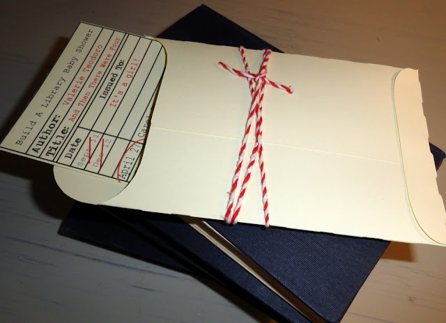
After I had the invitation printed, I used the library envelope image I had in my silhouette library.
It was an easy cut, I just had to make sure that the pocket would be large enough to hold my card.
Once you have the measurements correct, cut it out in the Silhouette.
I used my tape runner to seal the edges and slipped my library card invitation inside.
I added some bakers twine to complete the look.
That's it!
Easy custom invitations using your Silhouette designer software.


No comments